Who is this for?
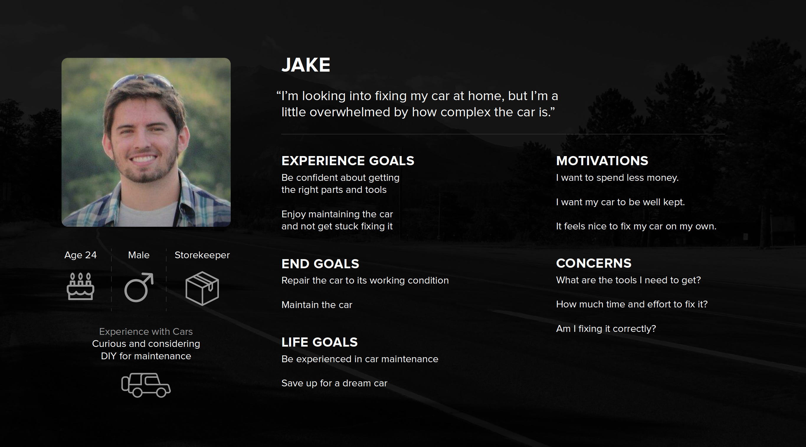
Car owners who are curious or want to be experts in maintenance of their cars
We'd love to show you how we designed Ignition
Year: 2015
Domain: Car Maintenance
Project type: Interface design for a mobile app
Project Brief:
Research, propose, design, prototype, evaluate and refine an interactive system designed for a specific domain and context.
Car owners who are curious or want to be experts in maintenance of their cars
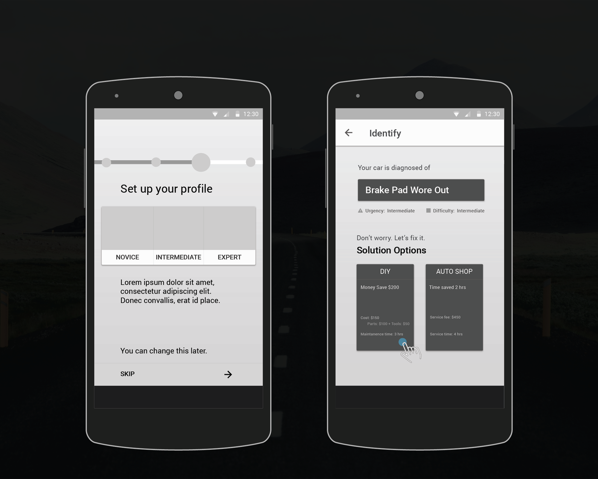
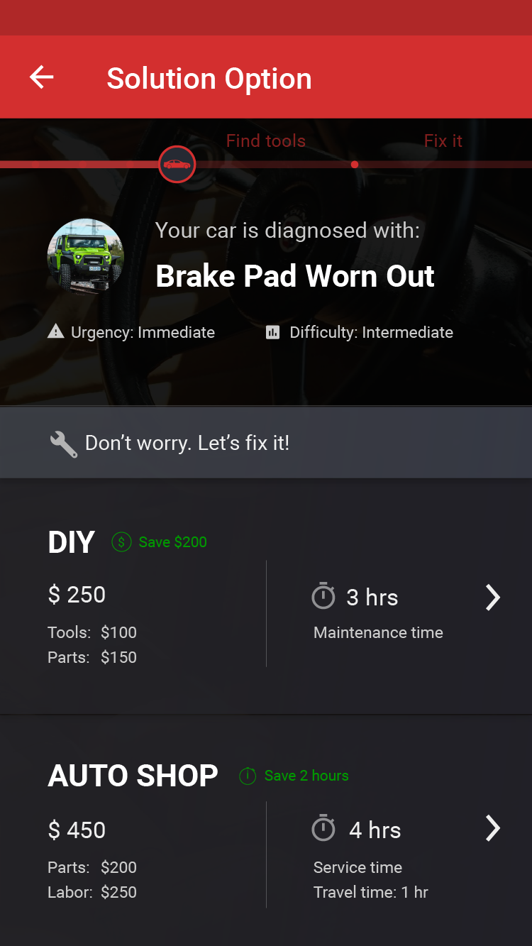
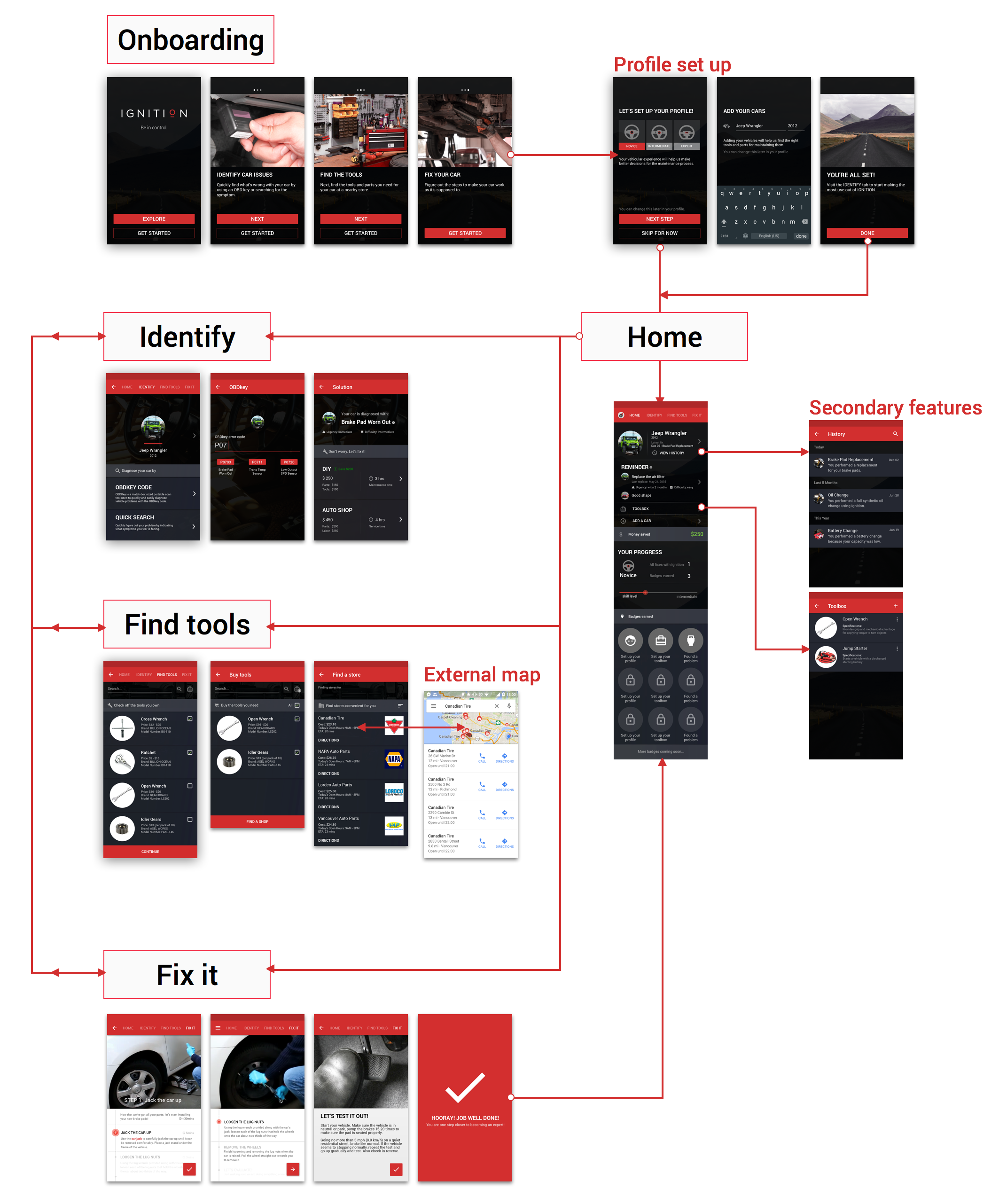
A mobile app that allows users to identify car issues, find tools, and fix it themselves.
We are reducing the overwhelming process car diagnostics by making it more efficient and as well as help users to get motivated to fix small issues themselves, saving them money and gaining experience.
providing meaningful information to allow them to make informed decisions
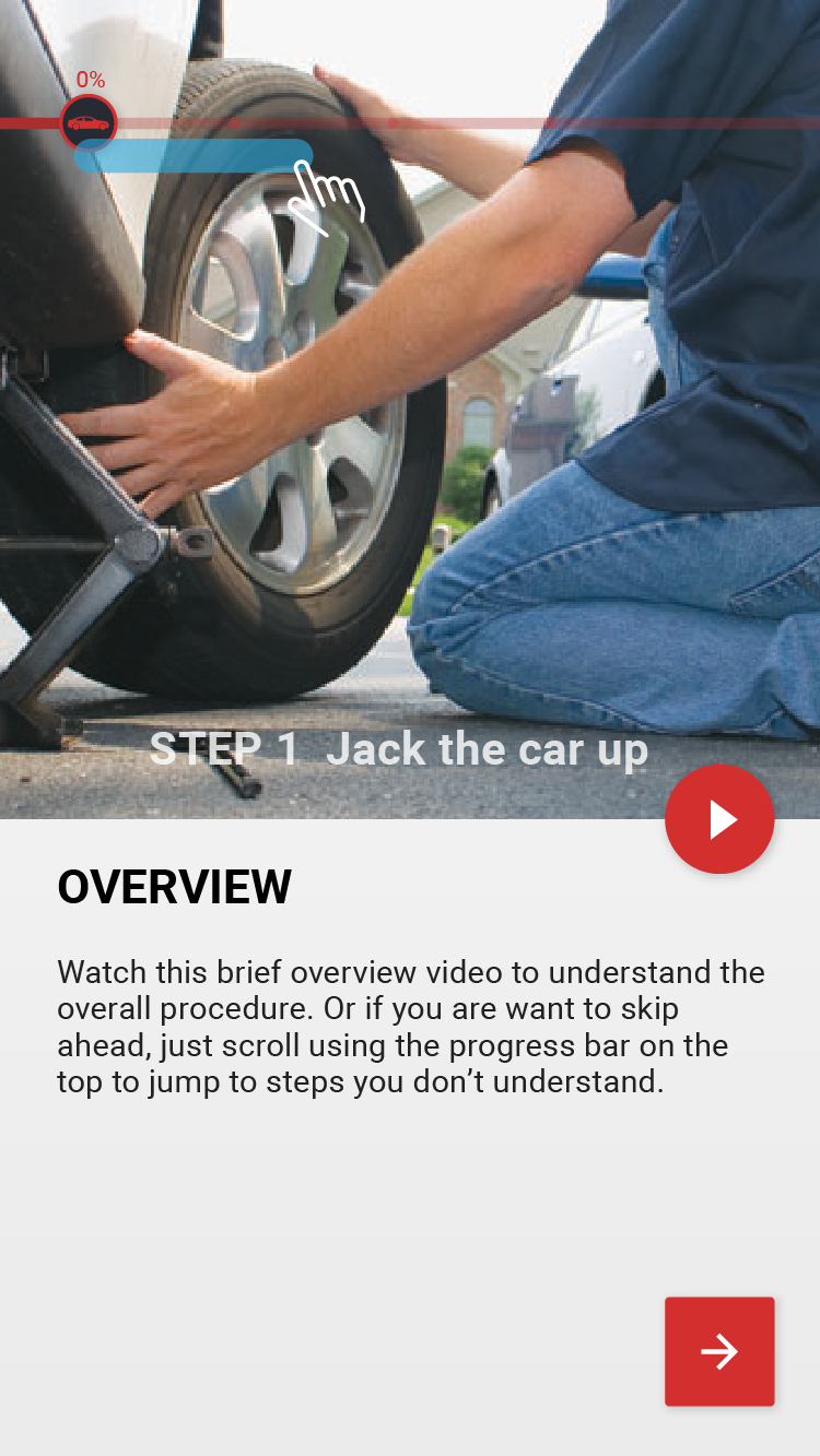
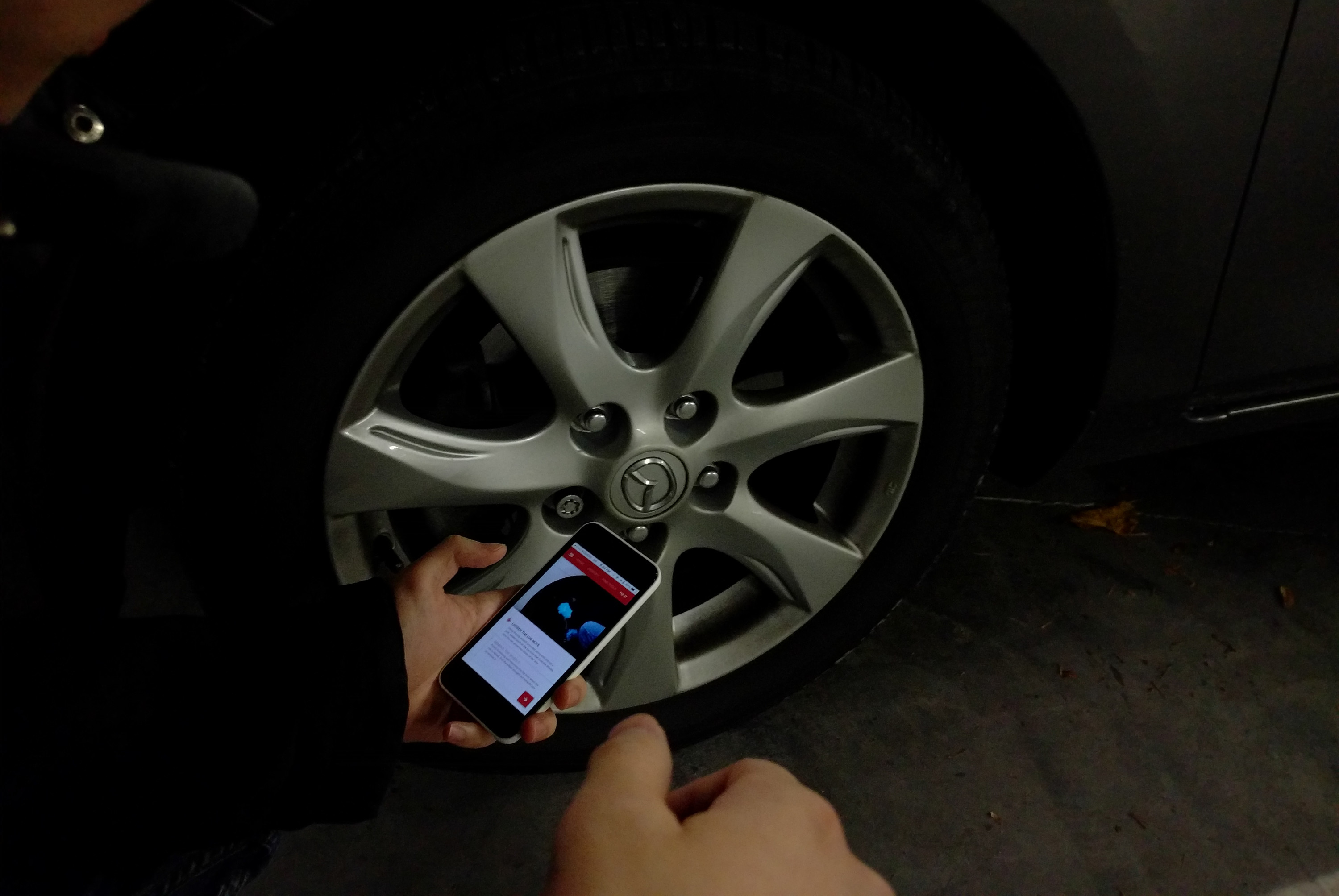
identifying problems through OBDKey code or by inputting the symptom
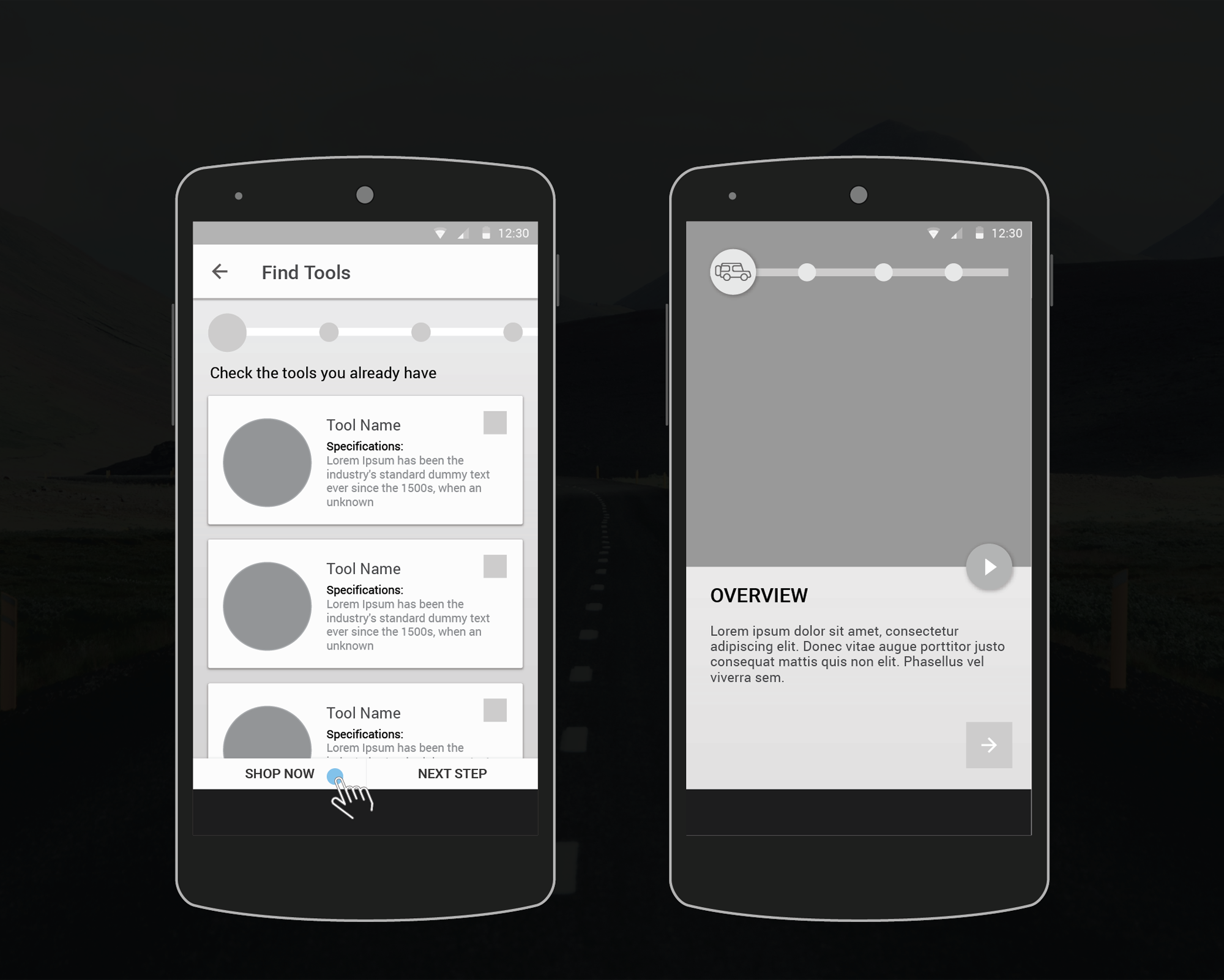
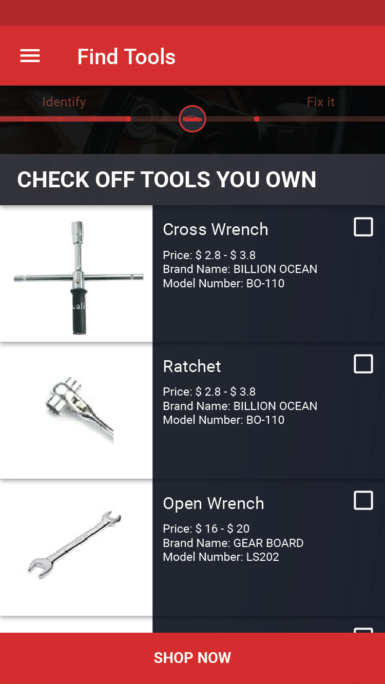
suggesting tools and parts and where to get them
showing easy to understand instructions with videos to accompany every step
expressing encouragement through tone and copy that this issue can be done easily
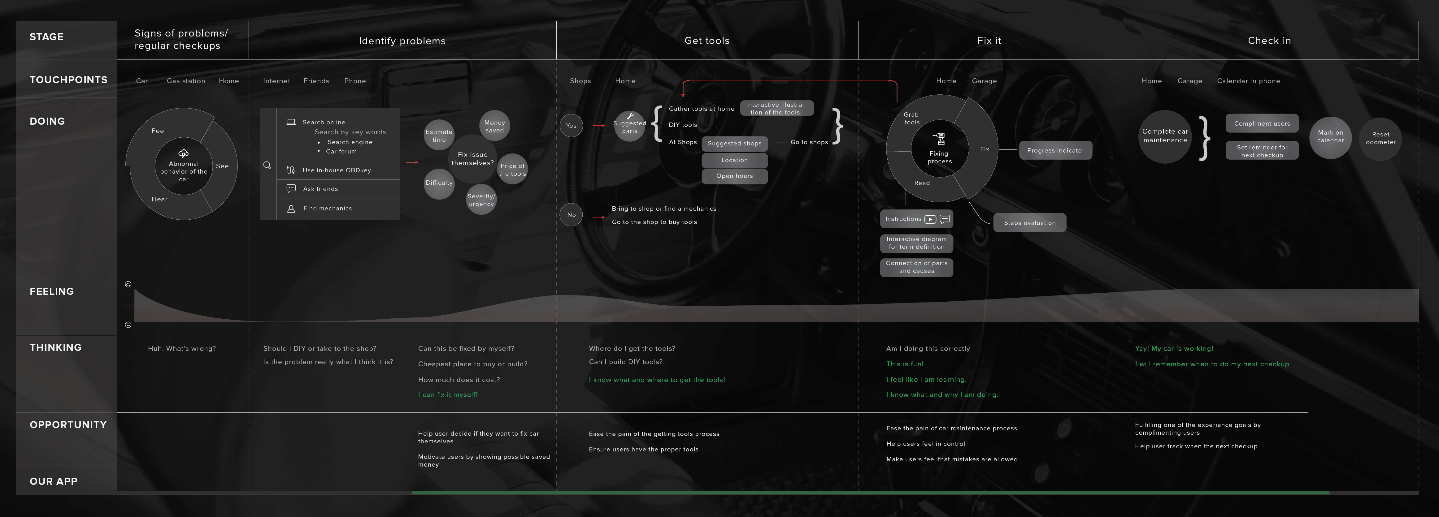
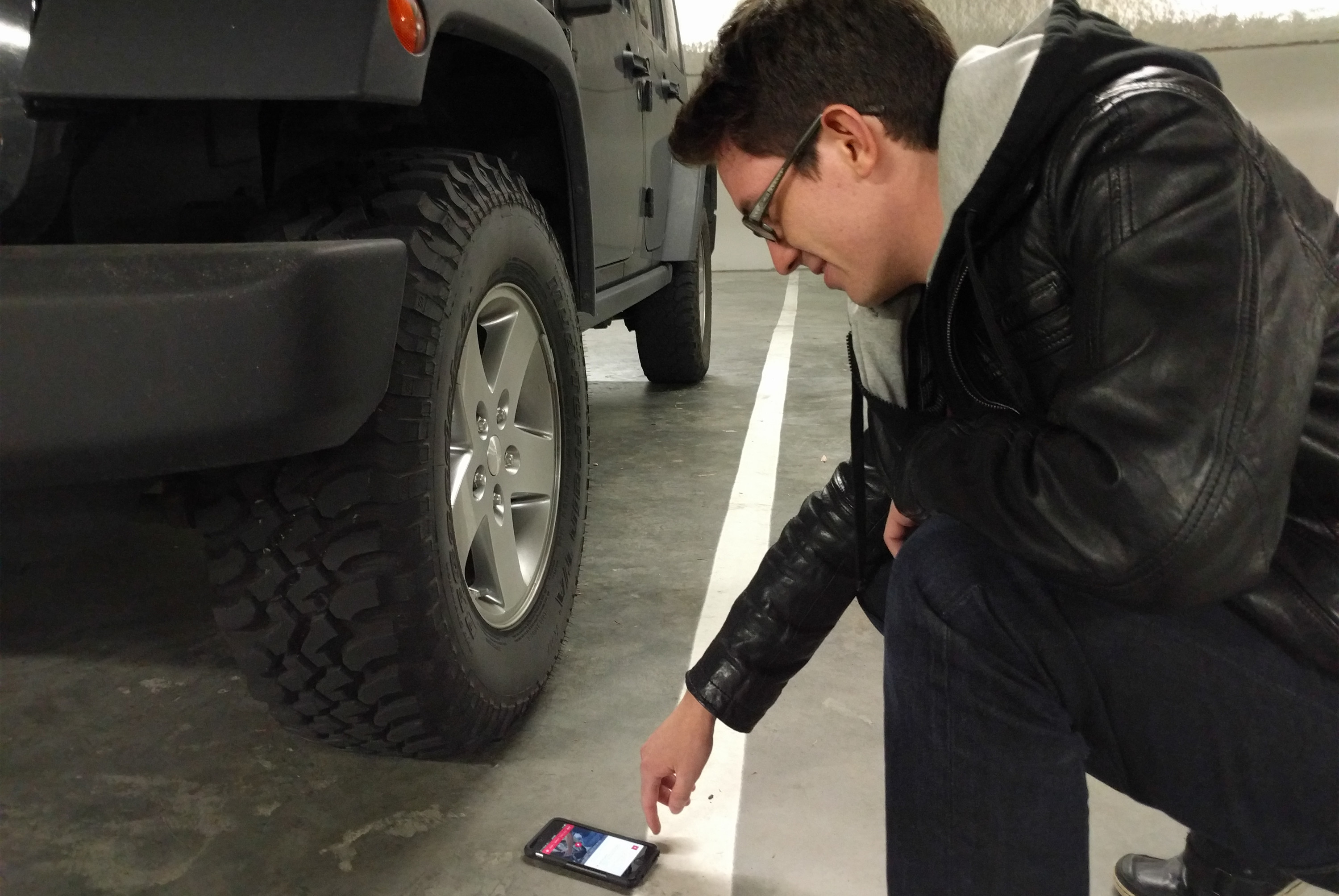
We conducted user interviews and online surveys on car owners to gather insights about the workflow of car maintenance and their motivations.


We identified a three stage user journey: before, during, and after car maintenance
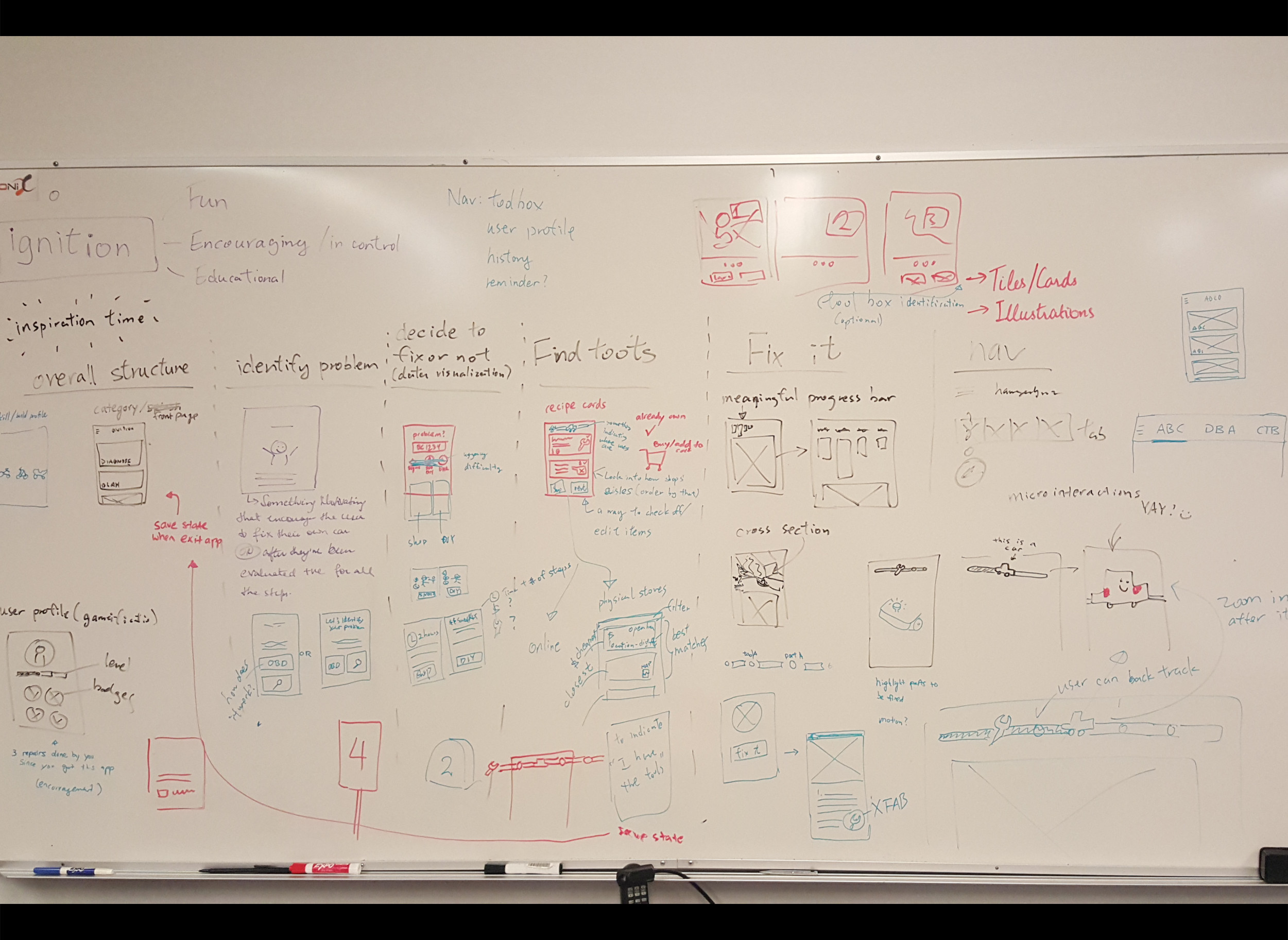
We developed a style guide to maintain a uniform look across all our screens.

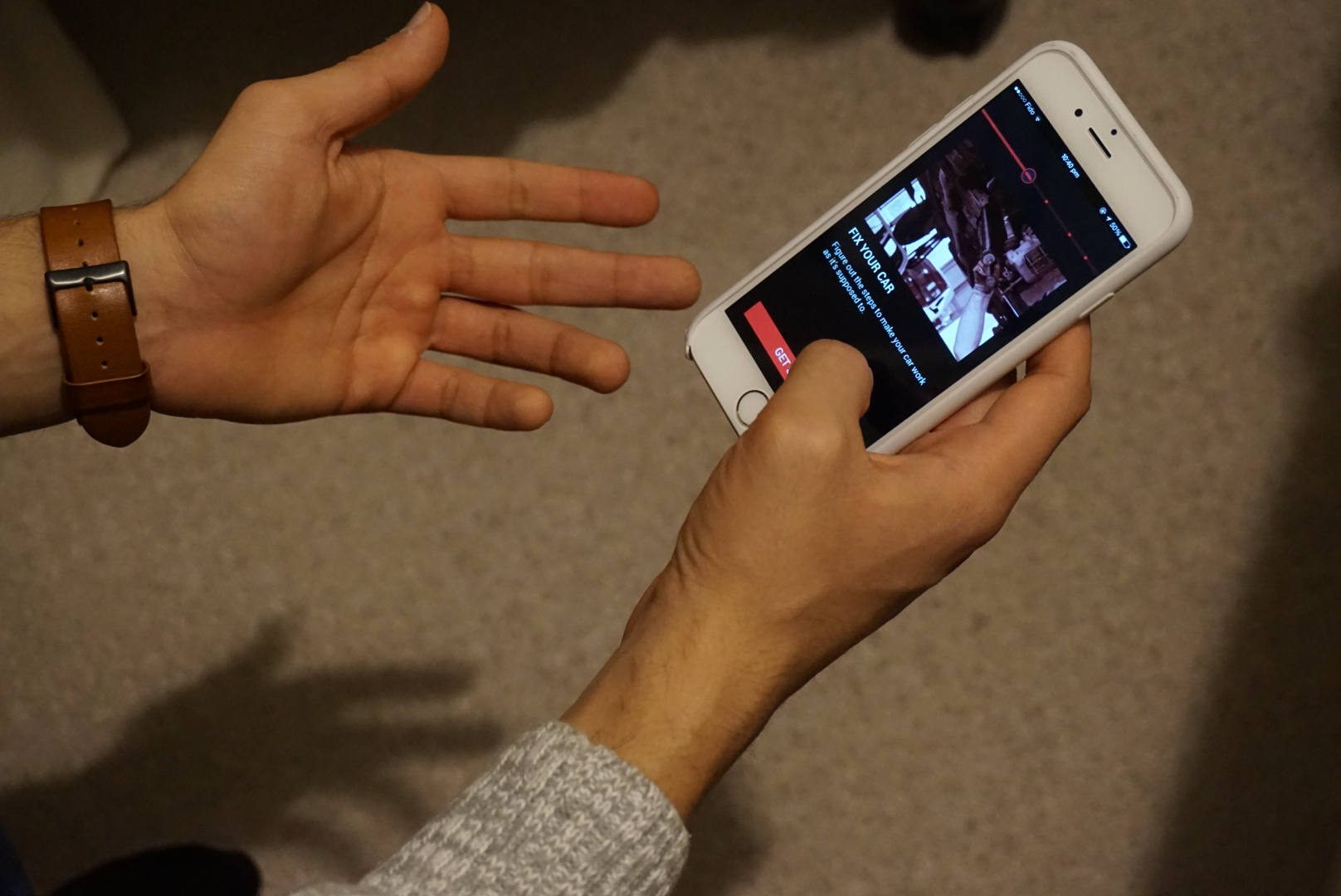
Methodology: Usability testing and interview
Think aloud, in-context, post-test questionnaire
Navigation confusion between main navigation bar, progress bar, and hamburger menu
Find Tools was confusing as there was a conflict between checking tools for toolbox or for shopping
Validated that experts like to skip and scan over steps, and that beginners are okay with single step-by-step to avoid overwhelming
The app motivated them through the interactions in addition to the knowledge of cost and time
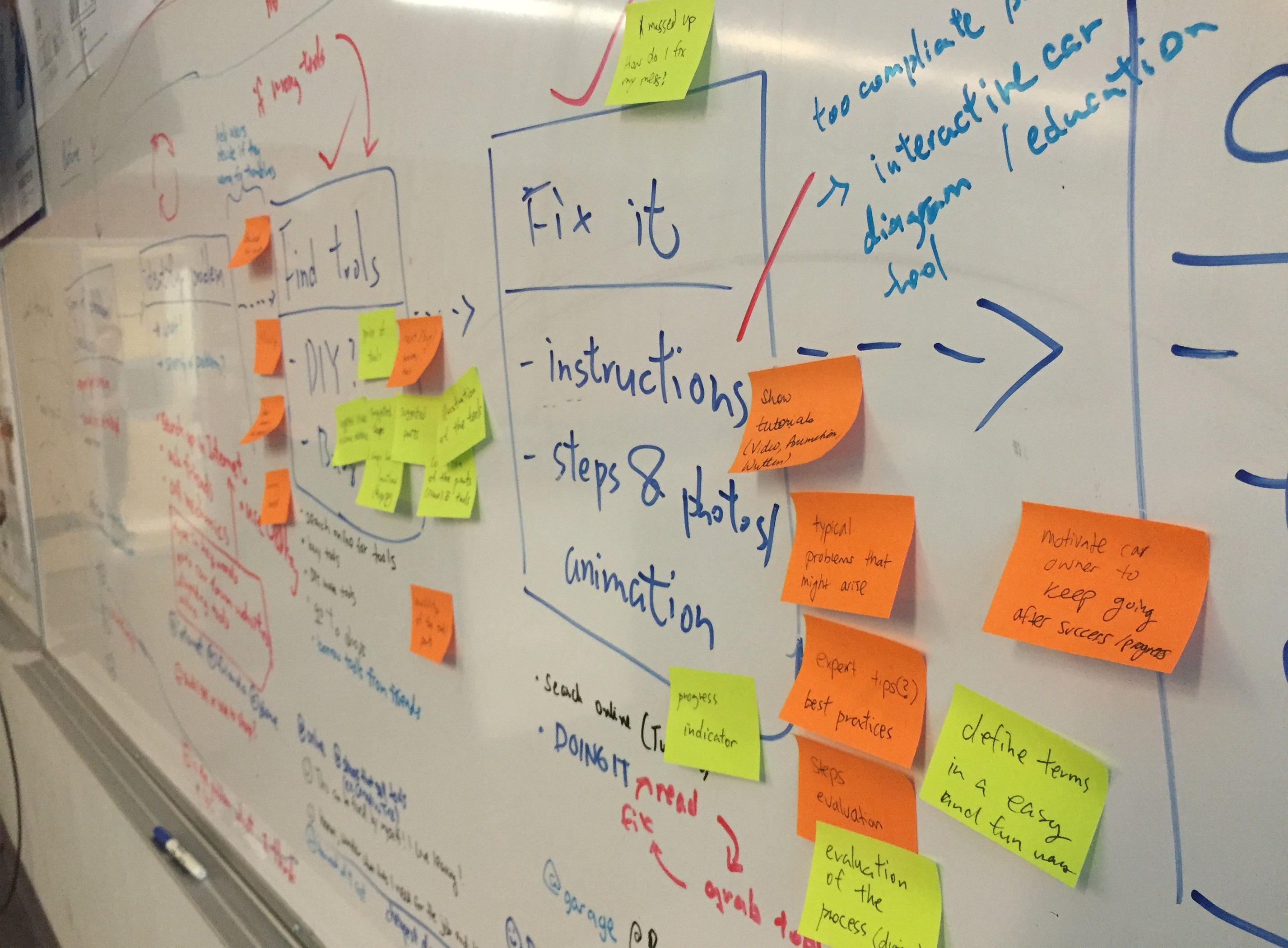
We reiterated our design after performing user testing and receiving feedback from critiques.
We recognized a need to emphasize what tools are being used for each step, as well as to clarify the navigation bar by removing the hamburger menu and consolidating the toolbox and history into the home screen, to remove the navigation issue and provide meaningful information at a glance
There are additional opportunities that we could pursue, such as expanding to other vehicles
(boats, motorbikes), as well as explore different types of interaction (motion, voice)
in a car maintenance environment.

Edward Chen UI/UX, interaction, copywriting

Gilbert Fung UX, web, wireframing

Eva Li UX, web, prototyper

Tavan Sohi UI, animation, interaction